
Internet Explorer’s Browser Mode vs Document Mode
Regardless of your personal feelings towards Internet Explorer, as a web professional you know that you have to test your creations in several versions of IE. Of course, that also means that you have to keep several virtual (or even physical) machines available – and not updated!
This has recently become even harder to do with Microsoft’s attempt to force-feed browser updates – at least to those on Windows 7 & 8. And while I applaud this effort, it has also complicated matters even more. I recently fired up my copy of Parallels and loaded a Windows 7 image that I use to test IE9… only to find out that IE had updated itself to version 10! Thankfully, Microsoft has begun to provide “locked” VM’s for testing purposes. You can find them at: http://www.modern.ie/
Of course, IE has had a method of testing in its Developer Tools for several versions now which allows you to “fake” which version of IE you are running. The problem with the feature is that there are two different modes, and it’s hard to tell (at least for me) what the difference is between the two. So, in the hopes of saving some hair pulling, here’s an explanation and example.
I was recently assisting my wife, Stephanie, on a promo page for her company, Contatta. On the page, they wanted a streamlined (i.e. single page) process for signing up prospects, and we chose to build the experience like an image slider. In keeping with best practices – and the fact that they only wanted IE9+ support, we chose to use CSS3 transitions to generate the motion and state changes. For the four “states” of the page, we created a wrapper div that was set to a fixed width/height and set to overflow:hidden. All of the “elements” that will “slide” in were set to position:absolute and transform:translateX(125%). To create the illusion of movement, we’ve also created a class that specifies transition:transform .5s linear 0s. Note: I’ve removed the vendor-specific prefixes.
To slide the element into view, a class is applied (or removed) that changes the translateX() value between -125%, 0 and 125%.
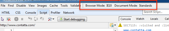
As you can see it works great in IE 10 – and all kidding aside, Microsoft has done a great job adding HTML5 and CSS3 features to IE 10. But, as you might know, transitions (the “animation” of the form) were not supported in Internet Explorer 9. Since my version of IE9 had upgraded itself to IE10, we needed a way to see what the lack of transitions in IE9 would do to the experience. Enter the developer tools…
As you can see, when we changed the Browser Mode to IE 9, the browser still transitioned (animated) the form – but IE 9 doesn’t support transitions! It’s not until we changed the Document Mode to IE 9 that the transition no longer happened.
Browser Mode defines the User Agent – what IE tells the server it is. Document Mode on the other hand determines “what” or “how” IE will render the page.
Using logic, we could just switch the Document Mode and think we’re “good to go”. But that’s not true either… as you can see below:
As it usually happens, after the page was built, “the powers that be” decided that they, in fact, did want IE 8 support. Which meant that not only did we have to come up with a solution, we needed to test it too.
There are a number of ways to serve alternate CSS to IE, but we chose to use an IECC (Internet Explorer Conditional Comment) – a stylesheet that is only shown to IE versions less than 9. As you can see, when we switch the Document Mode to IE8, we get craziness because IE8 does not understand the transform property. As I mentioned earlier, we’ve used the translateX() value to move the form “off screen”. So, for these older versions of IE, instead of using tranform:translateX(125%), we need to set the left (or right) property of the element.
Simply switching the Document Mode, however, did not tell the browser to read the IECC. As far as IE was concerned, it was still IE 9 (or 10 if we had left it at its default). In order to truly emulate IE 8, loading the page and its resources properly, we have to set the Browser Mode as well as the Document Mode.
While I still try to test on an actual version of Internet Explorer, the fact that the Developer Tools allows me to quickly test functionality as well as look and feel, while remaining in IE 10 is a great time saver… once I figured out what the two modes meant!


3 Comments »