Thu
23
May '13

Internet Explorer’s Browser Mode vs Document Mode

Regardless of your personal feelings towards Internet Explorer, as a web professional you know that you have to test your creations in several versions of IE. Of course, that also means that you have to keep several virtual (or even physical) machines available – and not updated!

This has recently become even harder to do with Microsoft’s attempt to force-feed browser updates – at least to those on Windows 7 & 8. And while I applaud this effort, it has also complicated matters even more. I recently fired up my copy of Parallels and loaded a Windows 7 image that I use to test IE9… only to find out that IE had updated itself to version 10! Thankfully, Microsoft has begun to provide “locked” VM’s for testing purposes. You can find them at: http://www.modern.ie/

Of course, IE has had a method of testing in its Developer Tools for several versions now which allows you to “fake” which version of IE you are running. The problem with the feature is that there are two different modes, and it’s hard to tell (at least for me) what the difference is between the two. So, in the hopes of saving some hair pulling, here’s an explanation and example.

Browser Mode vs Document Mode in Internet Explorer

I was recently assisting my wife, Stephanie, on a promo page for her company, Contatta. On the page, they wanted a streamlined (i.e. single page) process for signing up prospects, and we chose to build the experience like an image slider. In keeping with best practices – and the fact that they only wanted IE9+ support, we chose to use CSS3 transitions to generate the motion and state changes. For the four “states” of the page, we created a wrapper div that was set to a fixed width/height and set to overflow:hidden. All of the “elements” that will “slide” in were set to position:absolute and transform:translateX(125%). To create the illusion of movement, we’ve also created a class that specifies transition:transform .5s linear 0s. Note: I’ve removed the vendor-specific prefixes.

To slide the element into view, a class is applied (or removed) that changes the translateX() value between -125%, 0 and 125%.

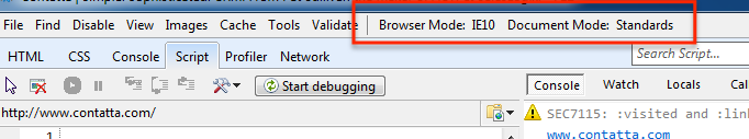
As you can see it works great in IE 10 – and all kidding aside, Microsoft has done a great job adding HTML5 and CSS3 features to IE 10. But, as you might know, transitions (the “animation” of the form) were not supported in Internet Explorer 9. Since my version of IE9 had upgraded itself to IE10, we needed a way to see what the lack of transitions in IE9 would do to the experience. Enter the developer tools…

As you can see, when we changed the Browser Mode to IE 9, the browser still transitioned (animated) the form – but IE 9 doesn’t support transitions! It’s not until we changed the Document Mode to IE 9 that the transition no longer happened.

Browser Mode defines the User Agent – what IE tells the server it is. Document Mode on the other hand determines “what” or “how” IE  will render the page.

Using logic, we could just switch the Document Mode and think we’re “good to go”. But that’s not true either… as you can see below:

As it usually happens, after the page was built, “the powers that be” decided that they, in fact, did want IE 8 support. Which meant that not only did we have to come up with a solution, we needed to test it too.

There are a number of ways to serve alternate CSS to IE, but we chose to use an IECC (Internet Explorer Conditional Comment) – a stylesheet that is only shown to IE versions less than 9.  As you can see, when we switch the Document Mode to IE8, we get craziness because IE8 does not understand the transform property. As I mentioned earlier, we’ve used the translateX() value to move the form “off screen”. So, for these older versions of IE, instead of using tranform:translateX(125%), we need to set the left (or right) property of the element.

Simply switching the Document Mode, however, did not tell the browser to read the IECC. As far as IE was concerned, it was still IE 9 (or 10 if we had left it at its default). In order to truly emulate IE 8, loading the page and its resources properly, we have to set the Browser Mode as well as the Document Mode.

While I still try to test on an actual version of Internet Explorer, the fact that the Developer Tools allows me to quickly test functionality as well as look and feel, while remaining in IE 10 is a great time saver… once I figured out what the two modes meant!

3 Comments »

Fri
23
Dec '11

Change happens: border-image breaks in Chrome

As anyone who has worked in the front-end dev world knows, keeping up with the “new” stuff is challenging. Thankfully, the browser makers have provided vendor prefixes which allow us to use a lot of the new CSS3 properties before they are finalized. But thanks to a reader of my blog, I was made aware that Chrome (version 16), as they removed the need for a prefix on border-image, has also changed the way the property is rendered. This morning, I awoke to find my site broken in the latest version of Chrome.

When I updated this blog to “HTML5″, I took the leap and used CSS3 everywhere that I could. This post area was a prime candidate for border-image. For the uninitiated, border-image allows you to use a single image as both a border and fill for an element. All you need to do is specify how much of the top, left, bottom, right of the image will be the borders, and how those pieces should fill each area (stretching or repeating).

Illustration of 9-slice from the W3C specificationDiagram illustrating the cuts corresponding to the value ‘25% 30% 12% 20%’ from the W3C specification

If you’ve ever used Fireworks, Illustrator or Flash, they all have a feature known as 9-slice scaling. Border-image is basically the same thing, but done on the fly via CSS. The rule for all posts here looked like this:

.post {
margin: 0 0 40px 0;
-webkit-border-image: url(images/article-background-stretch.png) 29 50 55 32 round round;
-moz-border-image: url(images/article-background-stretch.png) 29 50 55 32 round round;
border-image: url(images/article-background-stretch.png) 29 50 55 32 round round;
border-width: 29px 50px 55px 32px;
}

In keeping with best practices, you can see that I have listed the official property (without the vendor prefix) last, so that as browsers drop the need for the vendor prefix, they will simply read the last property – and the change will be seamless. Except in the case where all browser vendors are rendering a property different than the spec—thus lulling us into believing their rendering is correct when it is not.

A hole-y articleDon’t adjust your screen! This is what every post looked like!

There is actually an additional value in the spec called “fill”. The “fill” keyword instructs the browser to render the middle of the image as the background of the element. Without the keyword, the middle remains transparent (ie, the background-image or color is rendered instead). If there is no background-image or color defined for the element, it is simply transparent. Till now, all browsers have ignored the lack of the “fill” attribute and rendered the middle regardless. The code above worked perfectly—but it was based on improper rendering.

Chrome (actually, the change was made in Webkit) has recently changed their implementation of the border-image “fill” value as described in the spec. This is good, but it will ultimately break a lot of sites since many of us left the fill attribute off since vendors were ignoring it. Sloppy, sure. But it worked… until today.

So, dive back into your code and add the “fill” keyword if your site suddenly looks like swiss cheese. But you’ll want to (for now) only add the fill value to the non-prefixed version, as the addition of the value currently breaks Firefox if added to the -moz version of your rule (hat tip to @chriseppstein for that little nugget). My post class now looks like this:

border-image: url(images/article-background-stretch.png) 29 50 55 32 fill round round;

“fill” tells Chrome (and eventually other browsers) to render the center of your image as the background of the element. The two “round” values instruct the browser to tile the images on the x- and y-axis.

14 Comments »

Tue
16
Aug '11

The Importance of “s” in CSS3 Transition Shorthand

On a recent project, I spent the better part of an hour (okay, maybe longer) fighting with what I would learn is an interesting anomaly in the way that Firefox (4 and 5) deal with CSS3 shorthand transition notation. What baffled me was the fact that the other players, Webkit (Safari and Chrome) and Opera browsers, worked properly (or least what I thought was proper) with the exact same code. The premise was to have an area with a fixed height, set to overflow: hidden, but then allow the site navigation to scroll (transition) to the proper anchor, resizing the content box’s height to accommodate the contents while keeping the other contents hidden.

To illustrate the problem, have a look at this simplified example:

Sed do eiusmod tempor incididunt ut enim ad minim veniam, excepteur sint occaecat. Quis nostrud exercitation ullamco laboris nisi lorem ipsum dolor sit amet. Mollit anim id est laborum. Consectetur adipisicing elit, ut enim ad minim veniam, eu fugiat nulla pariatur. In reprehenderit in voluptate qui officia deserunt sunt in culpa.

Duis aute irure dolor ut enim ad minim veniam, velit esse cillum dolore. Quis nostrud exercitation. Ut labore et dolore magna aliqua.

Velit esse cillum dolore ut enim ad minim veniam, ullamco laboris nisi. Duis aute irure dolor sed do eiusmod tempor incididunt lorem ipsum dolor sit amet. Velit esse cillum dolore qui officia deserunt ut labore et dolore magna aliqua.

Mollit anim id est laborum. Ut aliquip ex ea commodo consequat. Eu fugiat nulla pariatur.

Ut enim ad minim veniam, velit esse cillum dolore qui officia deserunt. Sunt in culpa. Ullamco laboris nisi ut enim ad minim veniam, ut aliquip ex ea commodo consequat. Ut labore et dolore magna aliqua. Sunt in culpa consectetur adipisicing elit, mollit anim id est laborum.

The two columns of text each have a transform: translateY(-100px); applied to them on :hover. Additionally, they are both set to transition the effect – thereby “scrolling” the text up by 100px. Simple enough. And if you are looking at this in anything other than Firefox, both columns behave the same. (more…)

7 Comments »