Style Rendering Toolbar – Forgotten Dreamweaver Feature #712
It’s unfortunate that most web designers and developers pay little-to-no attention to their sites on anything but a browser running on their local computer monitor. The thought of designing a page to display properly on a mobile device or set-top browser rarely gets any braincells thrown at it. This is somewhat understandable, given the fact that the mobile browsing space is in such disarray.
But it frustrates me to no end when I need to save or print a web page, only to be given something that is at best barely useable. I’m sure most of us have had the pleasure of the four-page-print-phenomenon in which a seemingly simple web page causes the printer to spit out three additional (and completely blank) pages. It’s not rocket science to create a print stylesheet, but only the cream of the crop take the time to do it.
I think one reason that many Dreamweaver users don’t do it, is not only because they have the misconception that it’s difficult, but also because we did a really good job of hiding an essential tool for creating a print stylesheet (or handheld sheet for that matter). It’s called the Style Rendering Toolbar. Unfortunately, in our infinite wisdom, we chose to hide it by default – and, well, you know the rest…

First, let’s expose the toolbar. In order to do this, simply right click anywhere in the “document” toolbar – that’s where you have things like the document’s title and the Design/Split/Code buttons. Choose “Style Rendering” and you’ll see that a new series of buttons appears. These represent the different media types for which we can create stylesheets – and yes, that second one that looks like a printer is, in fact, your print stylesheet rendering. However, if you click it right now, you won’t see any change to your page due to the fact that you don’t have a stylesheet created for printing.
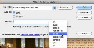
There are a couple of different ways to create a print stylesheet – but what I generally do, is to simply duplicate my “standard” sheet in Dreamweaver’s Files panel and rename it to something logical, like “printstyles.css”. Next, we need to link it to our page using your preferred method – which for me simply means clicking on the little chain icon at the bottom of the CSS panel. The most important part is to select the media type – and of course in this case that’s “print”.

Now, if we click on the print icon in the Style Rendering toolbar, we again won’t see anything different due to the fact that we simply duplicated the CSS. However, if you click into an element on the page and have a look at the CSS panel, you might see that your rules are duplicated. If that is the case, it means that you didn’t specify a media type for your original stylesheet – so you need to hop into code and assign a screen media type to it.
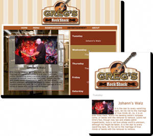
And now, it’s simply a matter of changing your styles to the way that you want the page to print. Generally, I’ll do things like setting the display to none for my navigation (which I don’t need on a printed piece of paper) and any pictures that are strictly decoration. I also - but what you do is up to you. Below you can see what one of my pages looks like on the web – and its completely changed look when printed.
Finally, one last tip… when you are setting up your CSS for printing you can’t use the new Live View feature because it’s actually showing the page as it appears in the browser and NOT how it would look when printed. In order to see your real results, head over to your favorite browser and use its Print Preview option.


September 22nd, 2009 at 9:17 am
I have a post on the insanity of trying to chase down mobile screen resolutions here: http://www.sanbeiji.com/archives/969
For mobile, the devices most likely to show up to one’s website are running WebKit-based browsers or the newest version of Opera, both of which default to using screen media type instead of handheld. Opera can switch to the handheld media type, but WebKit which is going to be found on the iPhone OS, S60, Android, and Palm Pre systems is fixed on screen media only. These browsers do have the ability to use CSS media queries though (which would be a nice add to the media bar in DW – nudge nudge wink wink say no more…)
That said, I do wish more people (or really, everyone) would test their web layouts on mobile, and particularly for iPhone. Often the print is tiny on the little iPhone screen and resizing the screen doesn’t help.
September 22nd, 2009 at 10:41 am
Joe, I couldn’t agree more. That’s why I tend to rant every now and then – okay, at just about every seminar. As the web moves into more and more places, from cellphones to set-top boxes to game consoles (and yes even to paper), web professionals need to be aware that their sites need to be capable of adapting to these (very) differing screens.