Change happens: border-image breaks in Chrome
As anyone who has worked in the front-end dev world knows, keeping up with the “new” stuff is challenging. Thankfully, the browser makers have provided vendor prefixes which allow us to use a lot of the new CSS3 properties before they are finalized. But thanks to a reader of my blog, I was made aware that Chrome (version 16), as they removed the need for a prefix on border-image, has also changed the way the property is rendered. This morning, I awoke to find my site broken in the latest version of Chrome.
When I updated this blog to “HTML5″, I took the leap and used CSS3 everywhere that I could. This post area was a prime candidate for border-image. For the uninitiated, border-image allows you to use a single image as both a border and fill for an element. All you need to do is specify how much of the top, left, bottom, right of the image will be the borders, and how those pieces should fill each area (stretching or repeating).
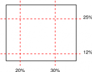
 Diagram illustrating the cuts corresponding to the value ‘25% 30% 12% 20%’ from the W3C specification
If you’ve ever used Fireworks, Illustrator or Flash, they all have a feature known as 9-slice scaling. Border-image is basically the same thing, but done on the fly via CSS. The rule for all posts here looked like this:
.post {

margin: 0 0 40px 0;

-webkit-border-image: url(images/article-background-stretch.png) 29 50 55 32 round round;

-moz-border-image: url(images/article-background-stretch.png) 29 50 55 32 round round;

border-image: url(images/article-background-stretch.png) 29 50 55 32 round round;

border-width: 29px 50px 55px 32px;

}
In keeping with best practices, you can see that I have listed the official property (without the vendor prefix) last, so that as browsers drop the need for the vendor prefix, they will simply read the last property – and the change will be seamless. Except in the case where all browser vendors are rendering a property different than the spec—thus lulling us into believing their rendering is correct when it is not.
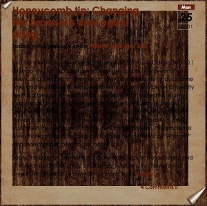
 Don’t adjust your screen! This is what every post looked like!
There is actually an additional value in the spec called “fill”. The “fill” keyword instructs the browser to render the middle of the image as the background of the element. Without the keyword, the middle remains transparent (ie, the background-image or color is rendered instead). If there is no background-image or color defined for the element, it is simply transparent. Till now, all browsers have ignored the lack of the “fill” attribute and rendered the middle regardless. The code above worked perfectly—but it was based on improper rendering.
Chrome (actually, the change was made in Webkit) has recently changed their implementation of the border-image “fill” value as described in the spec. This is good, but it will ultimately break a lot of sites since many of us left the fill attribute off since vendors were ignoring it. Sloppy, sure. But it worked… until today.
So, dive back into your code and add the “fill” keyword if your site suddenly looks like swiss cheese. But you’ll want to (for now) only add the fill value to the non-prefixed version, as the addition of the value currently breaks Firefox if added to the -moz version of your rule (hat tip to @chriseppstein for that little nugget). My post class now looks like this:
border-image: url(images/article-background-stretch.png) 29 50 55 32 fill round round;
“fill” tells Chrome (and eventually other browsers) to render the center of your image as the background of the element. The two “round” values instruct the browser to tile the images on the x- and y-axis.


14 Comments »