Moving Pictures : A JQuery Accordion Tutorial
At the recent Adobe MAX conference in San Francisco, I had the pleasure to show off Dreamweaver CS4 and it’s improved support for Ajax in the Day 2 keynote. In addition to continued support of the Spry Framework for Ajax, Dreamweaver CS4 also now provides the ability to add jQuery, YUI and MooTools web widgets to your pages. This ability, combined with the new Live Preview and Live Code features, means that you can see and style these widgets without needing to run to the browser. In fact, due to these enhancements, lots of folks who had even “given up” on Dreamweaver in favor of hand-coding are taking another look.
If you’re already using Dreamweaver CS4 and you’ve not yet visited the Dreamweaver Exchange to download any of the widgets already available, I’d encourage you to do so. You can even head over to the exchange directly from within Dreamweaver by clicking upon the “gear” icon in the Application bar and choosing “Get More Web Widgets”. By working with the OAA (Open Ajax Alliance), we’ve made it easy for developers to package any widget which conforms to the widget specification. You can read more about all of this by checking out the Dreamweaver Widget Packager on Adobe Labs.
Among the 20 initial widgets available, one of my favorites is the phatfusion “Image Menu”. This menu uses images that slide open to expose more of the selected image, which a potential visitor could then click to head off to that section of the site.
When I saw this for the first time, I was really amazed – the only problem being that I don’t use the MooTools framework very often. Instead, I spend my time with either Spry or jQuery.
So, I decided to build the same basic functionality (in a vertical orientation) using the jQuery accordion widget – which is also what I showed during the keynote at MAX. (If you’d like to try this yourself, you’ll first need to head over to the exchange and grab the jQuery Accordion widget. And if you need the files, you can download the finished version.)
First, let’s review… an accordion pane is a very simple widget which allows an unlimited amount of data to be displayed in a small space by showing/hiding a portion of the data at a time. Almost every framework has an accordion widget (even including non-Ajax frameworks such as Adobe Flex). In terms of implementation, an accordion (and basically every web widget) consists of a HTML structure, CSS controlling the presentation and JavaScript controlling the behavior.
A JQuery accordion is made up of an unordered list and a number of list items and looks like this:
<ul id="jQueryUIAccordion1" class="ui-accordion-container">

<li>

<span class="ui-accordion-left"></span>

<a href='#' class="ui-accordion-link">Accordion Panel 1 Title<span class="ui-accordion-right"></span></a>

<div class="ui-accordion-data">Accordion Panel 1 Content</div>

</li>

<li>

<span class="ui-accordion-left"></span>

<a href='#' class="ui-accordion-link">Accordion Panel 2 Title<span class="ui-accordion-right"></span></a>

<div  class="ui-accordion-data">Accordion Panel 2 Content</div>

</li>

</ul>

<script type="text/javascript">

jQuery("#jQueryUIAccordion1").accordion({ event: "click" });

</script>
As you can see, the unordered list is identified with both an ID and a class. The ID is used to uniquely identify the accordion on the page. Within the list, each list item contains a <span> followed by a link <a> which also contains a <span>. The contents of the anchor are used as the title of each accordion pane, and the spans themselves are used for styling purposes. Finally, a <div> element contains the actual content of the specific accordion pane. The last piece of the puzzle is the <script> block following the list. This is the JavaScript that actually triggers the creation, and in turn the functionality, of the accordion. Without this script, the accordion is nothing more than a standard, styled unordered list on the page – in other words, the content remains accessible at all times and to all visitors. Therefore, the key to the presentation of the accordion is the CSS.

If you’re following along yourself in Dreamweaver CS4, you should save the page after you’ve added the accordion to it. As you do so, you’ll notice that Dreamweaver prompts you to add some files to your local site. These are the required jQuery files – both javascript and css, and in this case even a couple of images for the rounded corners. Click the Live View button in Dreamweaver to have the page rendered as it will appear in standards-compliant browsers.
But the default CSS is… well… boring. So let’s change it to something more interesting.
The first thing that we’re going to do is get rid of some unnecessary code. As I mentioned, each of the list items contains two empty <span> elements that are used to create the (very hard to see in the default styling) rounded corners on the title area of the accordion. We’re not going to need these, so simply remove them.
<ul id="jQueryUIAccordion2" class="ui-accordion-container">

<li>  <a href='#' class="ui-accordion-link">Accordion Panel 1 Title</a>

<div class="ui-accordion-data">Accordion Panel 1 Content</div>

</li>

<li>  <a href='#' class="ui-accordion-link">Accordion Panel 2 Title</a>

<div  class="ui-accordion-data">Accordion Panel 2 Content</div>

</li>

</ul>
Interestingly however, if you turn on Live View again, you’ll notice no change to the accordion. It still has the rounded corners – even though we deleted the <span> elements that were used to create them! How can this be?! Well, it’s the jQuery magic. There are still two spans being inserted into the HTML dynamically by the Javascript. It all happens in the ui.accordion.js file on lines 42 and 43:
$("<span class='ui-accordion-left'/>").insertBefore(options.headers);

$("<span class='ui-accordion-right'/>").appendTo(options.headers);
Once again, a great new feature of Dreamweaver CS4 called Live Code helps demonstrate this. Clicking the Live Code button (you’ll first need to click the Live View button), instructs Dreamweaver to process the Javascript and display the code “after-the-fact”. This, in other words, is the “real” way the code appears to the browser. In this case, you can see that even though the <span> elements were removed in the HTML code, they are “back” in the code when the browser processes the Javascript.
If you look at the flora.accordion.css file, you’ll notice that those two elements created by Javascript also have some CSS declarations:
.ui-accordion li .ui-accordion-right {

display: block;

background-image: url(i/accordion-right.png);

position: absolute;

top: 0px;

right: -3px;

height: 28px;

width: 3px;

}

.ui-accordion li .ui-accordion-left {

display: block;

background-image: url(i/accordion-left.png);

background-repeat: no-repeat;

position: absolute;

height: 28px;

width: 3px;

}
There’s also a :hover selector for each element, as well as selectors for when the individual accordion pane is selected:
.ui-accordion li:hover .ui-accordion-left { background-image: url(i/accordion-left-over.png); }

.ui-accordion li:hover .ui-accordion-right { background-image: url(i/accordion-right-over.png); }

.ui-accordion li.selected .ui-accordion-left { background-image: url(i/accordion-left-act.png); }

.ui-accordion li.selected .ui-accordion-right { background-image: url(i/accordion-right-act.png); }
In order to truly get rid of the spans, we can simply comment out the two lines in the ui.accordion.js file – or, we can comment out or remove the declarations in the CSS file. In order to be most efficient, you’ll probably want to do both. With the declarations gone, and the Javascript file modified, we are ready to style the accordion.
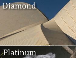
For my accordion, I’ve selected two images that have a bit of text overlayed in the upper part of the images.


In order to “display” the entire image, we’re going to need to slice the images up. A quick trip through Photoshop or Fireworks and I have the top each of the images sliced to a height of 39 pixels. I’ve simply saved them in a folder (along with the bottom slices) named “images”.
Returning to our markup, we have one final challenge to overcome. You’ll remember that each item in the accordion is really just a list item. But in the CSS, there is only a single selector “.ui-accordion li .ui-accordion-header” defined with the default background image. Because we need a unique background image for each list item, we’ll first remove (or comment out) the background-image property in the “.ui-accordion li .ui-accordion-header” selector.
In the HTML, we need to assign a unique ID to each list item. I’ve called mine #diamond and #platinum to match the pictures themselves.
Next we’ll create two selectors, one for each of the items in the accordion, and assign the two top slices of the images to them respectively. We also need a selector to constrain the width of the accordion, so we’ll use the <ul>:
ul {

width: 250px;

}

#diamond {

background: url(../../../images/diamond_top.jpg) no-repeat;

}

#platinum {

background: url(../../../images/platinum_top.jpg) no-repeat;

}
With that, if we take a look in Live View (or a browser), we’ve got an accordion that slides to reveal the larger image. Now let’s get rid of the title text which is overlaying the images. First, I’ve changed the text itself to match the individual images themselves. Obviously, we don’t want the text on top of the image, but we also don’t want to lose the text entirely for accessibility reasons. Remember, there are user agents such as screen readers that would not be able to “see” the text that is part of the image.
Therefore we need to add a span around the text itself and create a new CSS rule.
<ul id="jQueryUIAccordion1" class="ui-accordion-container">

<li id="diamond"><a href='#' class="ui-accordion-link"><span>Diamond</span></a>

<div class="ui-accordion-data"><img src="images/diamond_bottom.jpg" width="250" height="111" /></div>

</li>

<li id="platinum"><a href='#' class="ui-accordion-link"><span>Platinum</span></a>

<div  class="ui-accordion-data"><img src="images/platinum_bottom.jpg" width="250" height="111" /></div>

</li>
</ul>
The new selector:
.ui-accordion-link span {

text-indent: -1000em;

display: block;

}
The selector simply changes the display of the <span> to block so that we can position it, and then moves it offscreen by -1000 em spaces. This way, screen readers will see and read the text for the visitor, while still allowing the click within the anchor for standard user agents.


View the completed file. Finally, if you’d rather have the accordion react on mouse over as opposed to click, you can change the event trigger:
<script type="text/javascript">

jQuery("#jQueryUIAccordion1").accordion({ event: "mouseover" });

</script>
Hopefully you’ve enjoyed this little tutorial. Feel free to leave a comment, or to suggest other tutorials you would like me to write up. Happy Ajax’ing! Cheers.


April 15th, 2009 at 11:27 am
Is it not possible to use the ImageMenu plugin within Dreamweaver cs4 ‘as is’ (of course customizing re images). Does one have to use mootools or do what you did? I’m not a programmer.
Thanks
April 16th, 2009 at 8:47 pm
@Bill – Yes, you can use the ImageMenu “as is”. This means, however, that you would be using the MooTools framework. The point of my post was to show that you can do something very similar using the jQuery framework instead of MooTools.
In other words, it just depends upon which framework you want to use. I’m a fan of jQuery, but that doesn’t mean that MooTools isn’t a great framework.